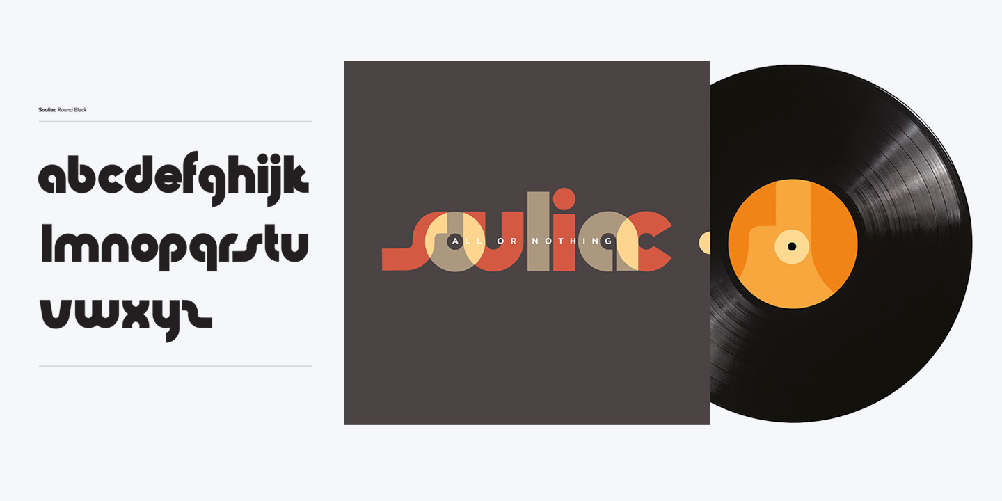
Designing for Souliac’s debut album, “All or Nothing,” was a journey into 70s-inspired soul scene. The cover, inner sleeve, and label were crafted to echo the era’s vibe while showcasing the band’s unique identity. At the heart of the design was the bespoke Souliac typographic branding, a hand-drawn font infused with soulful energy. Drawing from a colour palette reminiscent of the 70s, every element was carefully curated to evoke nostalgia and authenticity. The small semi-circular cut out on the cover allows access the inner sleeve, while the letter ‘o’ from Souliac namestyle serves as the reference for the centre label itself, tying together the visual narrative of the album.
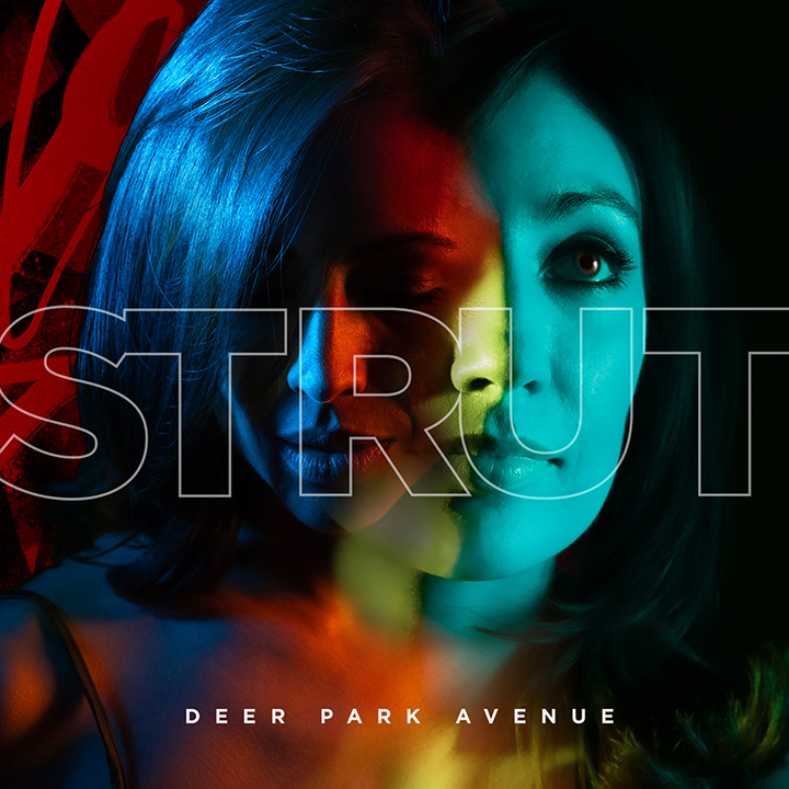
Deer Park Avenue Strut Single Sarah and Stephanie, the founders of Munich’s Deer Park Avenue, embarked on a quest for a visual identity as captivating as their indie rock sound. Hailing from the U.S., they sought a modern look that would live in the memory both in record stores and on digital platforms. The distinctive […]
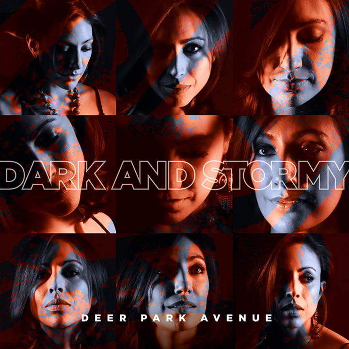
Deer Park Avenue Dark and Stormy EP Sarah and Stephanie’s EP release offers a more musical collective view into their upcoming “Crucible” album. Utilizing images from the original album shoot by German photographer Martin Stonard, the design montages a series of retouched and colour-graded shots, reflecting the EP’s title and the band’s indie rock vibe. […]